Last year I was lucky enough to be contacted by the Toronto Maple Leafs to design and illustrate a poster commemorating the top 100 Maple Leafs of all time. The posters were sold at Canadian Tire stores throughout the GTA with proceeds going to Canadian Tire JumpStart.
As a hockey fan this was a pretty cool gig but not without its challenges. The main one was that I would have to illustrate a hundred of the top Maple Leafs of all time, as voted by the fans, and it had to be done in a month. On top of the that I had to figure out how I was going to showcase each player without emphasizing one over another.
This was one of those gigs were you say ‘sure I can do it’ but you’re wary of the deadline. I wanted to paint this so badly but the deadline and the scope of the project made it pretty evident I would have to do something outside of the box.
This meant I wasn’t going to be able to illustrate it completely in Corel Painter. I would have to utilize Adobe Photoshop and "gradients" would be the key. Now I just had to come up with the design.
After a number of concepts the final idea was so simple and it fit the criteria of "not emphasizing one player over another". Before I even sketched it I knew the Leafs would love it. Thankfully my confidence was rewarded.
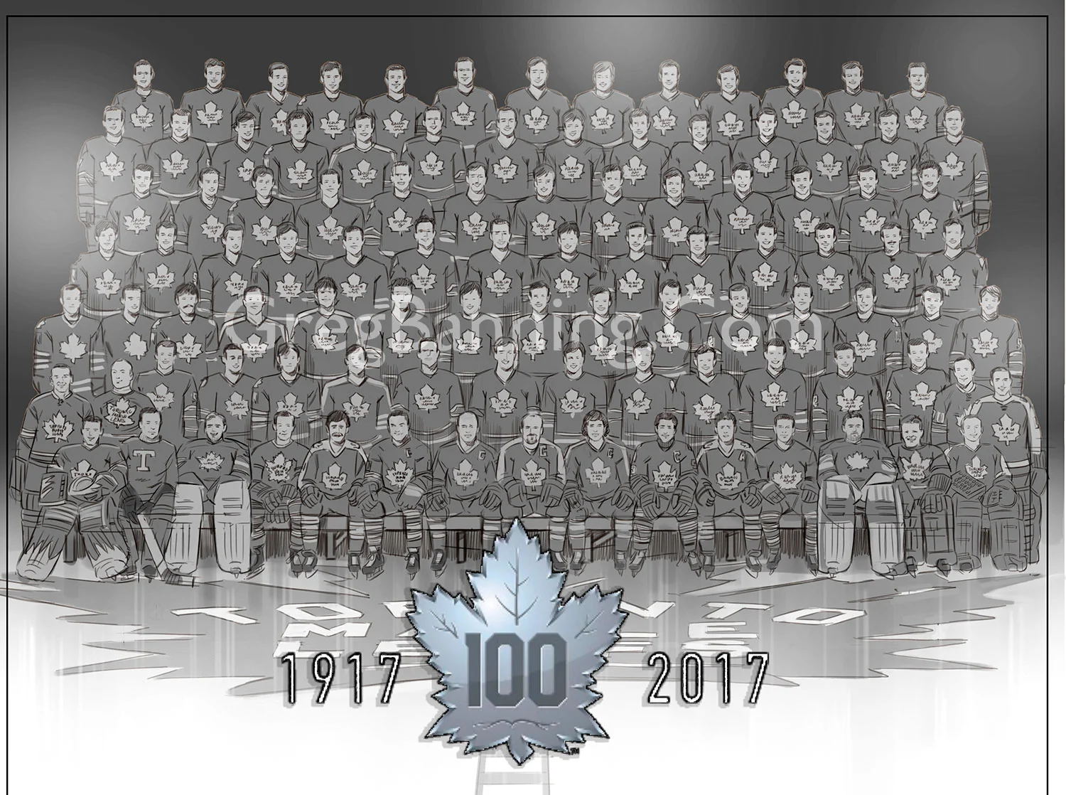
At this point, time was getting tight. On top of that the final list of players had yet to be decided. At least I had the top twenty to start with and Dave Keon was number one. The first two rows were tough. I had a lot of work sitting the players on the bench because I would have to draw their legs. After that was completed, it was a lot easier to do the rest because I just needed their waist up and I could duplicate the uniforms.
Now here’s my confession. As I said earlier… I would have loved to have drawn the whole thing from scratch but there was no way.
My solution or what I would like to say “technique” was to assemble the best photo reference I could find, clean them up, smooth out any pixelation and draw in anything that was missing. I wanted the players at this stage to be in greyscale for a number of reasons. First, I was colouring them using gradients in Adobe Photoshop so having them in greyscale would allow me to colour them with the same colour palette. Uniformity was important to give the illusion of the players all being together for the team photo and with the 10 decades of reference, the photos were all of various resolutions and quality. Now the process of colouring became an assembly line.
Which was huge because I was able to employ my friend and fellow illustrator Trevor Johnston to help apply colour.
The final stage was then placing the players together onto the background (which I painted separately). I used Corel Painter for all the drawing and painting and it came in very handy applying the finishing touches. A lot of work went in to creating the soft edges that blended the players together and into their surroundings.
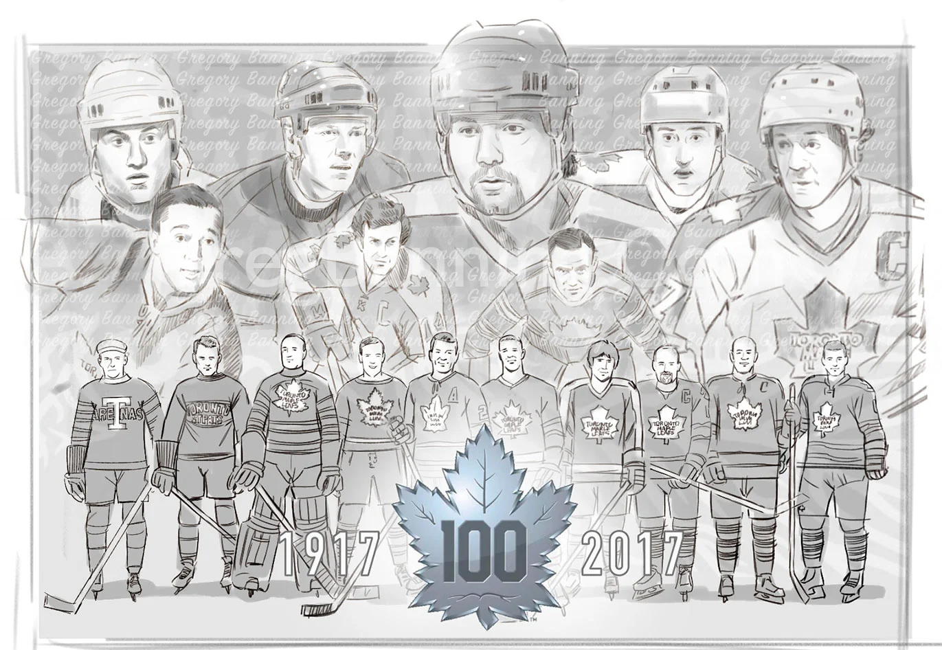
Concept 1
Approved Concept
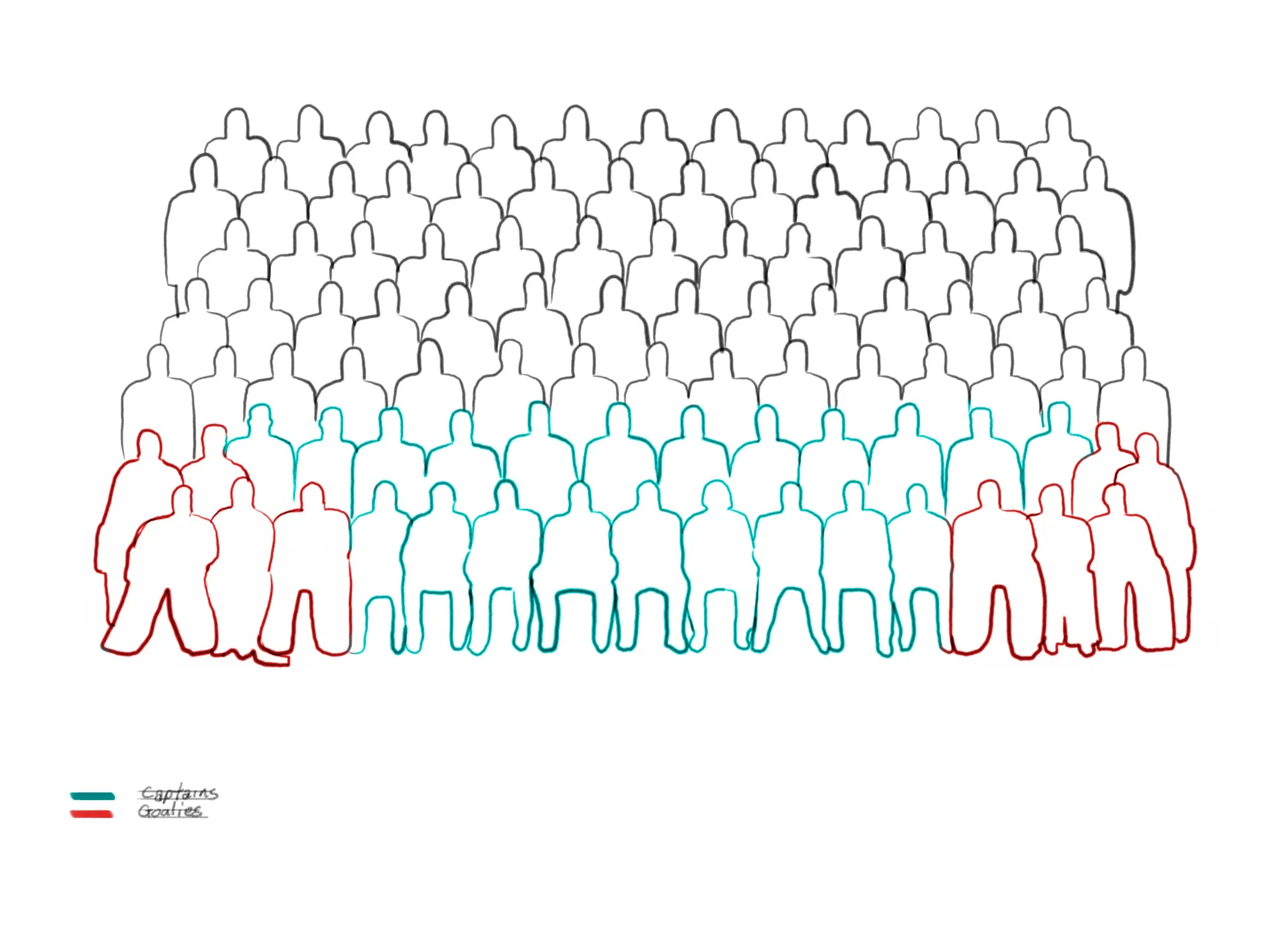
Seating Chart
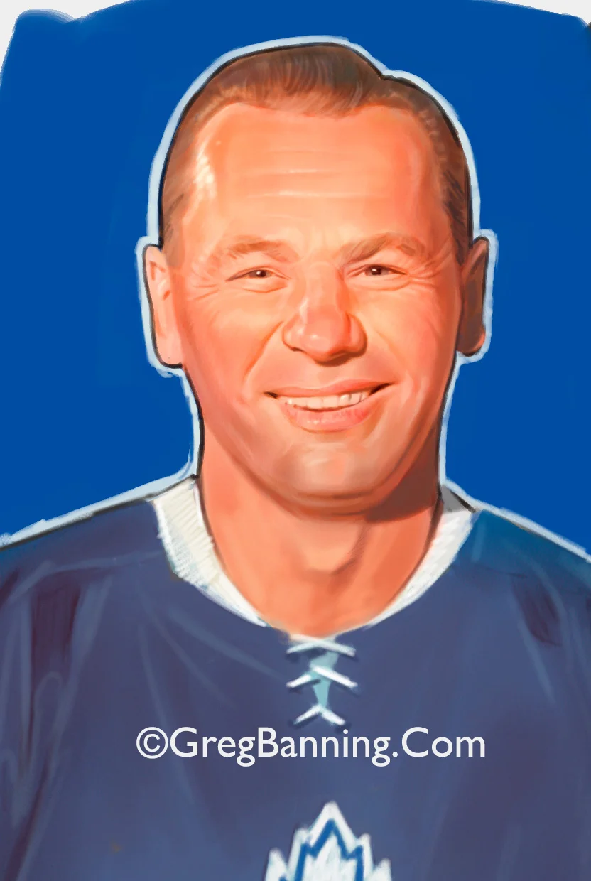
Johnny Bower Test
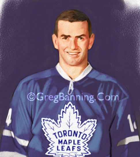
Dave Keon Test