Brawny Man featured on Live with Regis and Kelly

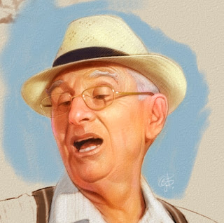
Kelly compared The Bachelor and Ted McGinley to The Brawny Man today. I was quite surprised to see the resemblance between Ted and Brawny.
It's kind of corny but I just had to write to them.

Here's what I wrote in my email:

I was thrilled to see that you compared Ted McGinley to the Brawny Man on your show today .
I'm the illustrator that re-imagined the new Brawny Man. So, I do agree Ted McGinley does look like the Brawny Man (I don't watch The Bachelor so I can't comment on that guy).
I wish I could also say it was a self portrait.
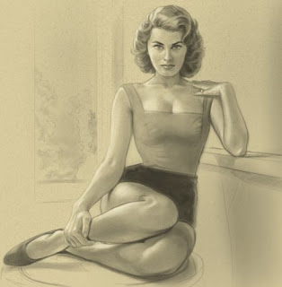
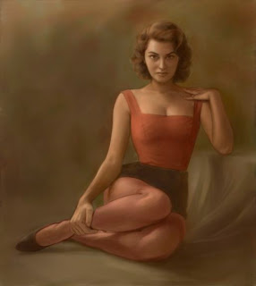
However The Brawny Man was based on a number of men. Including George Clooney, but it was based mainly on a model that I used for the pose.
The final result is mainly a characterization that allows The Brawny Man to be unique. 

OLG Illustration

I finished this piece last week for the Ontario Lottery and Gaming Corporation. It was a great experience and a lot of fun to do.
A big thanks to the creative at Draft FCB Toronto.

OLG has a graphic on the card. To protect their copyright I substituted it with my logo.


© Greg Banning 2011

Sophia Loren painting...continued

I finally had time to get back to this painting. After looking at it the pencil for a while I decided to try another approach and not to do an exact copy.
The whole point of this was for practice.

This was the original pencil...


And this is the painting started with the base colour applied.
(Now that I look at it I'm not sure if I should have just stayed with my original plan?)


© Greg Banning 2010

Preliminary Pencil

Here's a page I'm working on from my next book. I thought it was kinda of funny adding myself in as the co-pilot.

I must have used about 8 separate pieces of reference for this. Including a shot of me using Photo Booth from my MacBook Pro. (I just hacked in the cockpit door... I don't think it actually looks like that.)

© Greg Banning 2010

What I'm working on...

Here are two covers I'm working on simultaneously. One is a colour study, the other is in the pencil stage.
They are both for Penguin Canada.
© Greg Banning 2010

The pencil for the girl has yet to be finalized. Penguin needed it for their Catalog so I worked on this colour study more then I usually do.

 
© Greg Banning 2010

This is not a logo for a new Bagel Restaurant. It's going to be an element on a book cover that symbolizes an ancient necklace.
It's been a challenge to get the figurine to look sculpted... but I'm almost there.

Toronto Maple Leaf Poster

I made a Giclee print for a client by reworking some of my art from "Maple Leafs A-Z". The Giclee prints are quite expensive so unless there is demand I'm not sure if I'll make anymore . I'm hoping to eventually sell a poster version on my website.

Both the posters and the Giclee prints are 18x24. I'll post a photo of them after they are printed.

Painting on the flight home

Last week on the way home from Paris I did something I would never have thought I would be able to do 5 years ago. I finished off a painting (copy) on my Macbook Pro using Painter 11.

It started the day before I left when I was inspired by a painting I saw in a museum by the French Artist Sinibaldi. That night at the apartment I started blocking in the painting... then the next day after watching Shutter Island at the start of the flight and a glass of Scotch for courage.. I pulled out the laptop and began to paint.... thankfully most of the passengers were sleeping at the time. 


I wanted to mess around using the sepia and ochre underpainting and building my colours up with opaques.

I painted it free hand with no tracing... and though it's not as expressive as the original... I'm still happy with it. 


I'm just finishing up a trip to France. Here I am at the monument of Vimy Ridge.


Looking forward to getting home... maybe then I can finish off the illustration of Sophia Loren.

I wouldn't call it a demo.... more like practise. Illustrating Sophia Loren


I came across this photo on the web and instantly fell in love with the pose and inspired to draw it.
So I thought I'd share how the illustration progresses.


For the Pencil... I to work out the structure before moving on to colour. To me the drawing is drawn from the shadows and I like to know where my darkest areas are. 
(I'm not completely happy with the eyes. I hope to rectify it as I keep working on the tonal.)

To be honest this is just practise... so I might not care to have  the tightest of likenesses. Excuses... excuses.

My Studio

Since I just missed out on a contract for this week. I took the time to re-organize my office.
Now I just need a longer DVI cable to hook up the second monitor.